

If you’re shopping for gold foil business cards, you’re probably chasing a very specific reaction: that tiny pause when someone receives your card, tilts it toward the light, and thinks, “Okay… this is premium.” In a world where most networking happens on screens, a tactile, high-contrast black-and-gold card can do what a QR code alone can’t: create a moment of attention.
- Why black-and-gold reads “premium” (and why foil amplifies it)
- What “gold foil” actually is (quick, non-technical explanation)
- 12 bold black-and-gold designs that pop
- Choosing paper and finishes for gold foil business cards
- Common mistakes that make black-and-gold cards look cheap
- Real-world scenario: when premium cards actually pay off
- FAQ: gold foil business cards
- Conclusion: make your gold foil business cards feel intentional
That moment matters. Research summarized by a Harris Poll “Return of Touch” study (presented by Quad) shows people are craving more real-world, touchable brand experiences — and that touch influences decisions, especially for younger audiences. And on the production side, hot foil stamping isn’t just “gold ink.” It’s a finishing process that uses heat and pressure to apply metallic foil, producing a reflective, dimensional look that reads as luxury.
Below, you’ll find 12 black-and-gold concepts that consistently look expensive, photograph well, and print cleanly—plus practical tips on paper, legibility, costs, and common mistakes.
Why black-and-gold reads “premium” (and why foil amplifies it)
Black creates contrast and “negative space” that makes a design feel intentional. Gold adds warmth and status cues — especially when it reflects light instead of sitting flat like ink. Foil makes that “status signal” even stronger because it’s both visual and tactile.
There’s also a research-backed reason minimal, muted palettes tend to be perceived as more luxurious: a Journal of Consumer Research article links less saturated colors to higher perceived luxury brand status through learned associations (like heritage and continuity). In practice, black + metallic gold is a shortcut to that “low-saturation, high-status” feeling — without needing lots of color.
And it’s worth it to stand out. Business cards are still widely used, but many are discarded quickly, which means design quality has to earn “keepsake” status. One industry summary notes that 88% of business cards are thrown away within a week, making differentiation the whole game.
What “gold foil” actually is (quick, non-technical explanation)
When printers say “gold foil,” they usually mean hot foil stamping (or a digital foil alternative). In hot foil stamping, a heated die presses foil onto the paper using heat and pressure so the foil layer bonds to the stock.
That matters because foil:
- catches light (instant attention),
- adds texture (your fingers feel it),
- stays crisp on small elements better than many metallic inks (when the die is well-made and the design is prepared correctly).
If you want a deeper dive into the mechanics and materials, BOBST’s process overview is a solid reference from a major print/packaging equipment manufacturer.
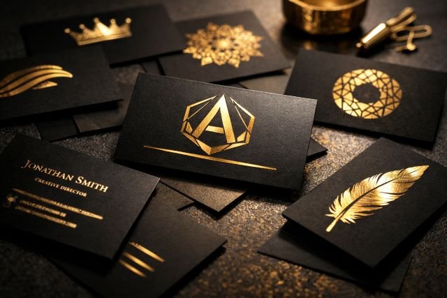
12 bold black-and-gold designs that pop
Each design below includes a real-world use case, so you can match the style to your brand instead of picking something that only looks good on a mockup.
1) The “One-Line Luxury” Minimalist
This is the cleanest version of gold foil business cards: matte black background, and a single gold-foiled line that underlines your name or frames the bottom edge.
It works best for consultants, attorneys, founders, and anyone selling expertise. The minimalism says “I’m confident,” and the foil line creates a premium cue without clutter. Use a slightly larger font for your name than you think you need — minimal designs live or die by typography.
2) Foiled Monogram in a Corner (Quiet Flex)
A small foiled monogram (or initials) in the top-left or bottom-right corner is subtle, expensive, and easy to print reliably. It looks especially sharp on thick stocks (think 32pt or more) with a soft-touch lamination.
This design is ideal if you want the foil to feel like a “signature,” not a billboard. Pair it with black ink text (not foil) for phone/email so the essentials stay readable under any lighting.
3) Full-bleed Black + Foil Logo Only
If your logo is strong, go logo-only on the front: black card, centered gold foil mark, no text. The back holds the details. This is one of the highest “wow per square inch” layouts because it forces attention onto one element.
This style is perfect for creative directors, luxury salons, premium product brands, and boutique agencies.
4) Gold Foil Border Frame (The “Invite” Effect)
A thin gold foil border around the edges makes the card feel like an invitation or certificate. It’s formal, structured, and very “high-end.”
Practical tip: keep the border slightly inset from the cut line so trimming variations don’t visibly break the frame. Your printer can advise the safest margin.
5) Diagonal Gold Foil Slash (Modern & Energetic)
A bold diagonal foiled slash across the card adds motion and personality. It reads modern—great for fitness brands, real estate, nightlife, DJs, or tech startups that still want premium.
Balance it by keeping text minimal and aligned to one side. Too much copy fights the geometry.
6) Spot Foil Pattern (Texture You Can Feel)
Instead of one big foiled element, use a repeating micro-pattern: tiny dots, a geometric grid, or a subtle brand motif. When someone runs their finger across it, they feel the pattern.
This is a smart move if your brand is detail-oriented — think architects, product designers, high-end skincare, or premium stationery.
7) Emboss + Gold Foil (Maximum Tactile Impact)
Combine embossing (raised paper) with gold foil for a high-relief logo or crest. BOBST notes foil stamping can be combined with embossing and other structural effects.
This is the “hand it to someone and they won’t throw it away” approach — perfect for luxury hospitality, bespoke tailoring, fine jewelry, or premium event planners.
8) Black Soft-Touch + Gold Foil Script (Premium Personal Brand)
Soft-touch lamination gives black a velvet-like feel. Pair that with a gold foil script signature (real or stylized) and you get an instantly personal, high-ticket vibe.
Use this for coaches, speakers, creators, and personal brands where you are the product. Keep the signature foiled, but print contact details in high-contrast ink for readability.
9) Reverse Contrast: Gold Foil Name + Black Ink Details
Some designs foil the name/title and keep details in ink. It’s elegant, but you have to manage glare: foil text can reflect light and become harder to read at certain angles.
If you choose this, keep the foiled text larger (name/title only) and avoid foiling tiny characters like URLs.
10) Foiled QR Accent (Hybrid Print + Digital)
If you want measurable follow-up, integrate a QR code — but don’t foil the QR itself. Instead, foil a small icon, border, or callout like “Save My Contact” to draw attention.
This taps into the broader trend of physical touchpoints complementing digital behavior — exactly what the “Return of Touch” research suggests consumers want.
11) Black-on-Black Texture + Gold Foil Highlight (Understated Luxury)
Use a black ink pattern on a black background (a “blind” pattern), then hit only your logo or name with gold foil. It looks subtle in normal light but comes alive when the card moves.
This design screams premium because it rewards attention. It’s fantastic for brands in luxury interiors, high-end photography, or boutique finance.
12) The “Gold Edge” Illusion (Design-only, no painted edges required)
Painted gold edges can be pricey. A smart alternative is to print a black card with a thin gold foil edge band on the front and back, giving the illusion of gilded edges when stacked or viewed quickly.
For many businesses, this delivers the aesthetic without the production complexity of true edge painting.
Choosing paper and finishes for gold foil business cards
Design is only half the effect. Stock and finish determine whether the card feels like luxury or like a shiny sticker.
Matte black stocks and soft-touch lamination are the usual winners because they create contrast: matte absorbs light, foil reflects it. Thick stocks help too, because weight influences perceived quality (people subconsciously equate thickness with value).
If sustainability is part of your brand story, ask for recycled or FSC-certified options and test how your chosen stock handles foil. Foil needs a surface that bonds cleanly — your printer will usually recommend a coating or lamination to improve transfer consistency. The technical principle is the same: the foil layer bonds via heat/pressure activation.
Common mistakes that make black-and-gold cards look cheap
The irony of luxury designs is that small production mistakes show more.
Over-foiling is the biggest one. If everything is gold, nothing feels special — and it can start to look like novelty glitter. Use foil as an accent that points to what matters: logo, name, signature, or a single design feature.
Second is legibility. Gold foil on black is striking, but tiny foiled text can become hard to read because reflections vary by angle. Keep critical details in ink, and reserve foil for the “hero” elements.
Third is ignoring bleed and trim tolerance. Borders and tight frames can look crooked if your layout doesn’t leave safe margins.
Real-world scenario: when premium cards actually pay off
A strong card is a conversion tool, not just stationery. A survey release from MOO (conducted by Ipsos Observer) reported that 44% of small business owners believed handing out 100 business cards could generate $5,000 or more in revenue, and nearly 90% said networking led to at least some new business.
You don’t need to take the “$5,000” as a guarantee — but it’s a useful framing: if your average client value is high, paying extra for a premium finish (like gold foil) can be rational because it increases the chance your card gets kept, remembered, and followed up.
FAQ: gold foil business cards
Are gold foil business cards worth it?
Yes when your business depends on trust, perceived quality, or high-value relationships. Tactile brand experiences influence consumer behavior, and consumers are actively seeking more real-world touchpoints. Premium cards also stand out in a category where many are discarded quickly.
What’s the difference between gold foil and metallic ink?
Gold foil is a bonded metallic layer applied through a stamping process that uses heat and pressure; it’s reflective and often slightly dimensional. Metallic ink is printed like normal ink and usually looks flatter and less reflective.
Can you foil small text or QR codes?
Small foiled text is possible, but it’s riskier and can reduce readability due to glare. For QR codes, it’s typically better to print the QR in ink and use foil as an accent around it, not as the code itself.
Which finish looks best with black-and-gold?
Soft-touch lamination plus gold foil is a classic because it combines a velvety matte feel with a high-reflection highlight. Matte lamination also works well for a cleaner, slightly more corporate look.
How do I keep a black-and-gold card readable?
Put essential info (phone, email, website) in high-contrast ink, and use foil for the logo or name only. Increase font size slightly and avoid ultra-thin typefaces for small text.
Conclusion: make your gold foil business cards feel intentional
The best gold foil business cards aren’t loud — they’re deliberate. Black gives you focus. Gold foil gives you a premium cue that people can see and feel, using a process designed for decorative, high-impact finishes.
If you want a card that actually gets kept, pick one hero foiled element, pair it with a tactile black finish, and keep the information architecture simple. In a market where many cards are tossed quickly, your goal is to create a “this is too nice to throw away” moment — and black-and-gold, done right, is one of the most reliable ways to get it.